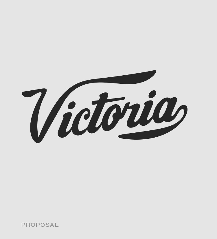
Victoria beer is one of the most popular brands in Mexico. We were asked to create a proposal for their new can packaging keeping certain similarity with the original bottle. During the process we considered a light logo facelift respecting the essence of the brand. This is the result.
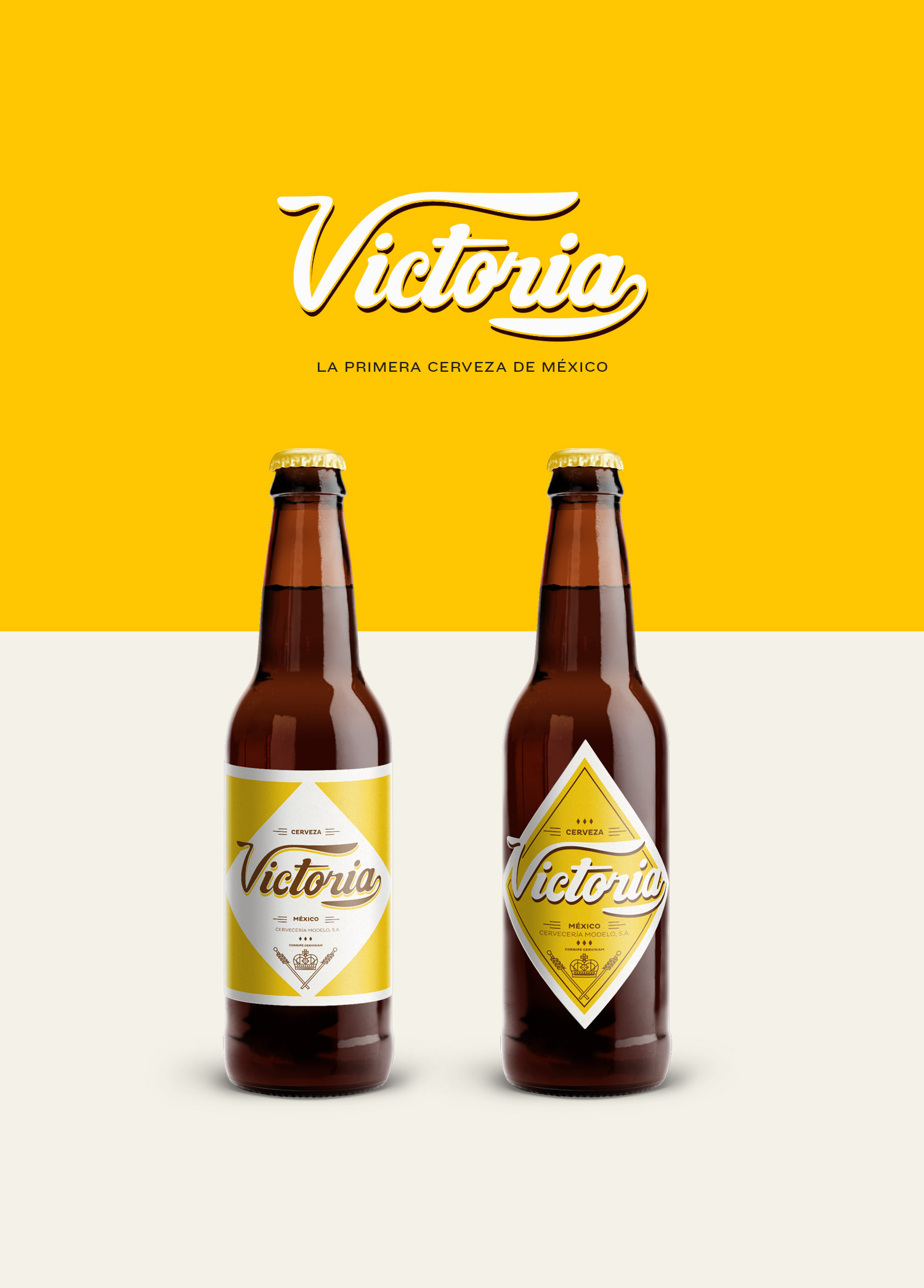

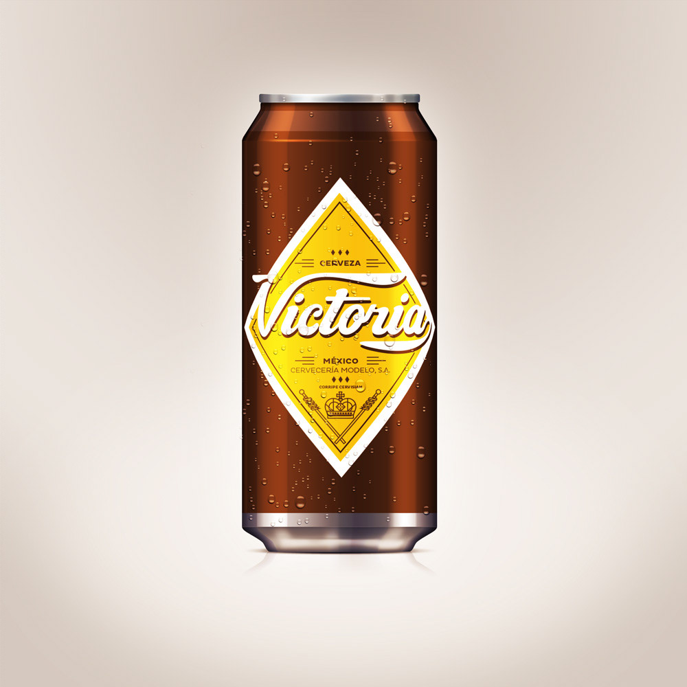
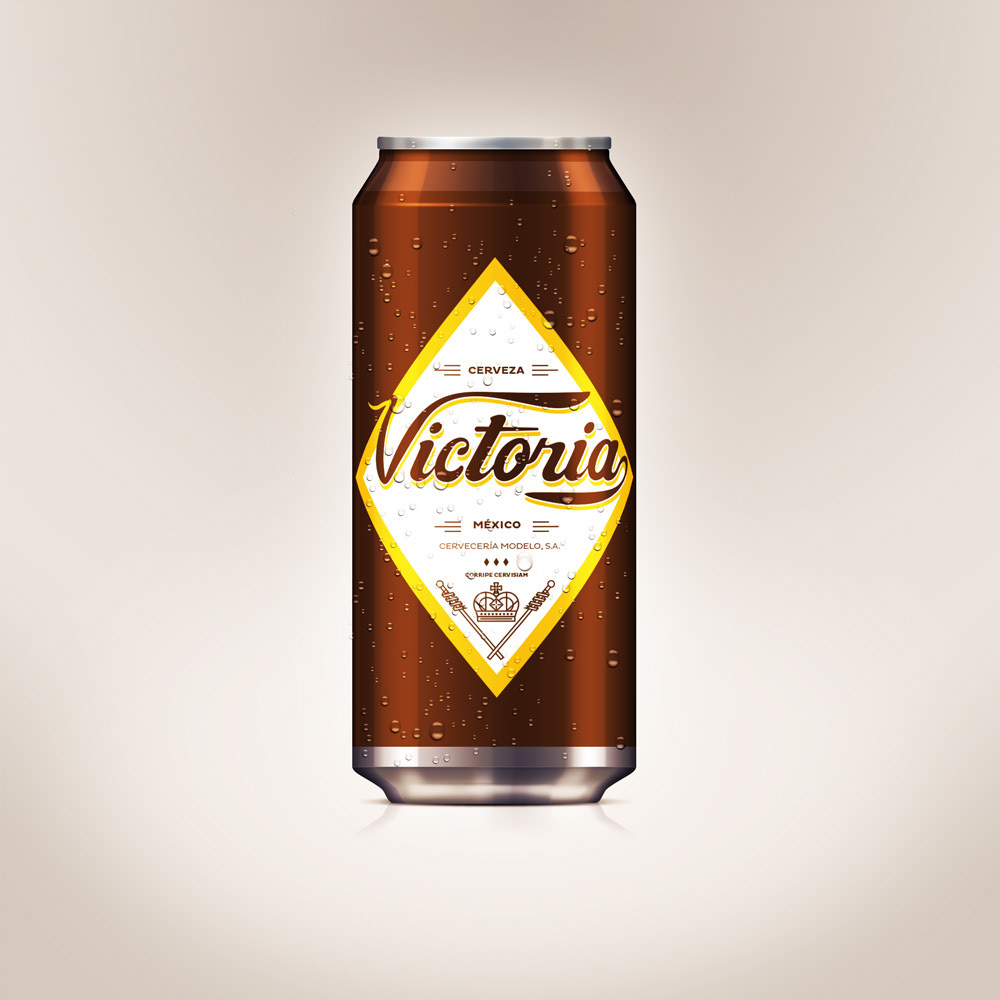
Here is the comparison. The original lettering seems to be scanned and never retrace. We created a bolder lettering to give the "V" a element a stronger presence and personality so it could be applied in different ways.